Pure Energy 1988 to 2009 ...
1986
So from that evening on Pure Energy was born ... A cutting edge mobile disco specialising in Rave and Techno music ...
 Back
in the late 80's Pure Energy started as a company designing sounds for
the music industry specialising in sound banks for the Roland, Yamaha,
Akai and Korg Synthesizers. We also produced
Back
in the late 80's Pure Energy started as a company designing sounds for
the music industry specialising in sound banks for the Roland, Yamaha,
Akai and Korg Synthesizers. We also produced 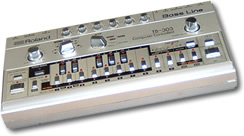 interfaces for old music equipment like the Clock II Sync for the Roland TB-303 which was instrumental (literally!) in creating the sound of Acid House music.
 A Return to Simplicity
 Full Circle?
They say that fashion and style repeats itself - well this could be true for branding and logos too. Pure Energy has now revisited its orginal branding to incorporate it into a new striking image.
1986
Once apon a time there was a mobile disco called "Light Fantastic Discos". It was run by Jason Fitzpatrick and Jason Sharp - two 16 year old school boys with nothing better to do. We played local pubs, our school (Samuel Ward Upper School), village halls and loved every minute.
1988
I think we were in "The Cloak" in Wickhambrook one evening discussing the future of our business in the entertainment industry and we decided that the name "Light Fantastic" was, with hindsight, possibly the most naff name for a disco we could have possibly have come up with. Several pints later it was decided that the name "Pure Energy" was the one that really suited the type of modern cutting edge disco that we were!
The idea came from a phrase uttered by Spock in the Star Trek episode "Errand of Mercy" in 1967, and was later sampled by the Information Society in 1988 and used in their track "What's on your Mind"
So from that evening on Pure Energy was born ... A cutting edge mobile disco specialising in Rave and Techno music ...
The End of the Eighties
Back
in the late 80's Pure Energy started as a company designing sounds for
the music industry specialising in sound banks for the Roland, Yamaha,
Akai and Korg Synthesizers. We also produced interfaces for old music equipment like the Clock II Sync for the Roland TB-303 which was instrumental (literally!) in creating the sound of Acid House music.The logo was created to reflect the spacey far out sounds that we
were creating and what better than an alien wearing headphones!
The image was very striking and very popular finding its way on to
thousands of tee shirts for which we never received 1 penny of
royalties! Do you have one of those tee shirts in your loft? Please
contact us if you do, we'd love to get hold of one ...
The Mid Nineties
Later on, in the mid 90's the music scene that we were into started to fade and we turned our attention to the web. Previously we had developed our own website to sell the sounds and products we created world-wide and saw first had the huge potential of the Internet from a commercial persepctive.
Later on, in the mid 90's the music scene that we were into started to fade and we turned our attention to the web. Previously we had developed our own website to sell the sounds and products we created world-wide and saw first had the huge potential of the Internet from a commercial persepctive.
We company became pure energy multimedia and specialised in the
development of feature rich, interactive websites that had a strong
commercial lean. Because the company was to work a more corporate
client we decided that sadly the alien logo had to go ...
The New Millennium
The year 2000 came along and again it was time to look at the branding. A new millennium and a new look. 3D was very much in vogue and we transformed the logo into a 3D model that could be animated and used in the opening sequence of video productions that we were becoming involved with.
The year 2000 came along and again it was time to look at the branding. A new millennium and a new look. 3D was very much in vogue and we transformed the logo into a 3D model that could be animated and used in the opening sequence of video productions that we were becoming involved with.
2004 saw a complete return to simplicity. Gone were the
complicated backgrounds and 3D text. Instead a simple clean corporate
grey look that fitted very well with the type of projects that we were
undertaking.
They say that fashion and style repeats itself - well this could be true for branding and logos too. Pure Energy has now revisited its orginal branding to incorporate it into a new striking image.
For years we have displayed the pure energy alien as a poster on
the wall at our offices. It acts to remind us of the past and is often
commented upon by visitors as a great image.
So now, the alien image with headphones is back again. The alien
representing the future and our constant reach for projects that are
ahead of thier time and the headphones representing the media side of
our company which is growing very significantly. It was again, the
perfect icon.
However, simply revining the old logo was not going to cut the
mustard. The colouring had to be changed and the alien needed to be
removed from the inflexible solid background.
We also needed to represent our huge experience in e-commerce and
website development which is the mainstay of our company. It was time
to look at the words 'pure energy'. It sums up our enthusiasm for the
web and all things media related. Helen Mayes, our graphic designer
worked a stroke of genius and used the two e's in the middle to
represent our e-commerce strengths. With one e mirroring the other our
creative team quickly came up with the line 'reflecting the needs of
e-business' and the new brand was born ...
The alien image is so striking and memorable that with time we
believe that the isolated use of the alien logo itself will become
enough to represent the company and its work.